Peer2Peer

Project type

Mobile Application
Role

UX Designer & Researcher
Year

2022

How can we reduce the stress that college students experience deciding on a major, making, friends, and growing professionally to prepare for life after college?

Overview
Peer 2 Peer is an application that provides a platform for students to explore majors, access information about events and workshops on campus, connect with peers, and ask questions related to coursework and academics.
This project was completed by myself and three other undergraduate students over the course of 10 weeks for a User Centered Design course in the Human Centered Design and Engineering department at the University of Washington in the Winter of 2022.
Background
A big part of college involves figuring out what to do in life which can be a stressful experience. Students often experience stress related to deciding on a major, applying for a major, making friends, and growing professionally to prepare for life after college. Although the University of Washington offers resources for students, these resources can be overwhelming to navigate because they are scattered across different programs and departments. There is currently no system that consolidates information for students and provides a way for students to navigate majors, find peers, and access professional resources all in one place.

Research
User Interviews
We conducted semi-structured interviews with 12 students from the University of Washington. Our goal was to gain insight into their academic experiences, including their current major, the process of applying to their major, and the resources the university offered to assist them in deciding on a major. We also asked them about the resources they wished were available at UW to guide them through their overall journey, their family background and their experiences meeting other students in their major.
Key Findings
People seem to be more influenced by the information they get from their peers, friends,and students over the advice given by counselors
Resources aren't  consolidated for students so they have to go to different places, departmental websites, application websites, and external forums to find the information they want, making the process of finding information difficult
Clubs and upperclassman have a big influence on people's choice of major
User Personas
We then created personas synthesizing the findings from our interviews. Our personas allowed us to identify the challenges students face at each stage of their journey through UW. Our first persona Maya helps to represent users that transfer into UW from community college which was one of the key user groups we discovered in out interviews. Stacie represents a users that have more a traditional path into college straight from high school. By using the personas as a guide, we were able to create a user journey map that reflected the experience of UW students researching and applying to their major
Design
Key Design Features

After reviewing the needs of our users, we decided to group our requirements into two different groups: Interface Requirements and Processing Requirements. Interface Requirements mainly covered how our visual design would cater to the needs of our users. In contrast, Processing Requirements covered the conceptual technicalities of how information on the back-end would be disseminated and filtered to provide an intuitive experience for users

Interface Requirements
  • The design should have a way for students to connect and communicate with one another
  • The design should cater to undergraduate students with different major statuses.
  • The design should suggest events and workshops based on the user profile,inputted data, and interactions
  • The design should have a forum feature where students can post questions andhave their questions answered by other students and advisors
  • The design should allow students to react and respond to other student’s posts in the forum
Processing Requirements
  • The design should filter peers to display to the user based on the user’s profile data
  • The design should dynamically change the information on home screen blocks(Major planner, Forum, Peer Finder, Events & Workshops) based on the user’s data (interests, majors, peers, etc.)
  • The design should retrieve information from different UW resources (department websites and course information) to provide consolidated information about different majors that the user can easily filter through.
  • The design should provide the option to SSO using NETID to help reduce the amount of data the user has to input.
User Journey Map

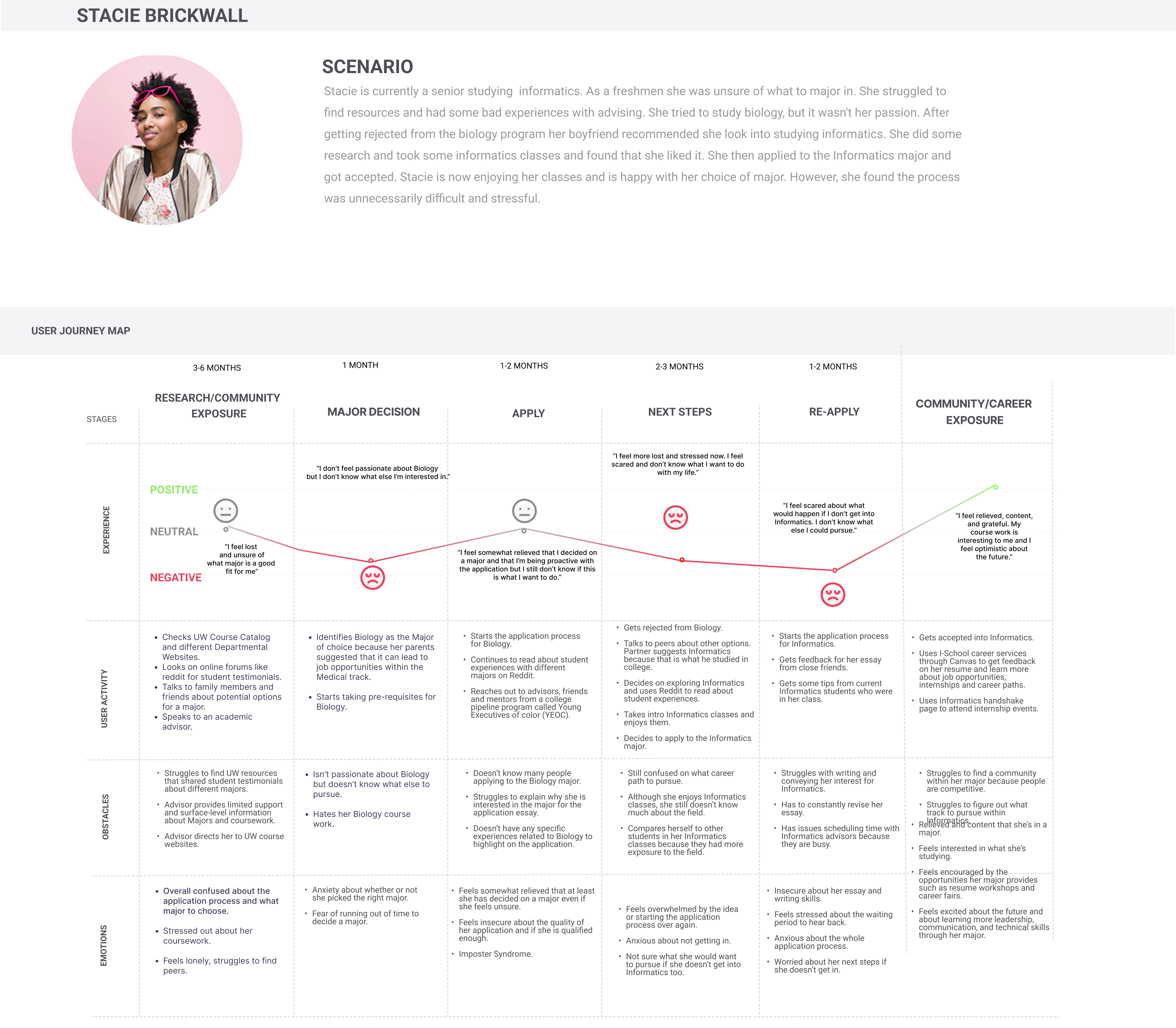
We created a user journey map focusing on one of our personas, Maya Cinderblock, a UW student studying informatics, we created a user journey map that outlines her experiences from the time she began researching possible majors to the time she got into her major. While the majority of the map was based on user research, we had to make some assumptions on Maya’s thoughts and emotions due to time constraints. The journey map provided a complete overview of Maya’s experiences and allowed us to gain a deeper understanding of her needs and pain points throughout her major discovery and application journey. By identifying these barriers, we were able to design our application to meet the needs of our users and create a more streamlined and effective program for them.

Story Boards

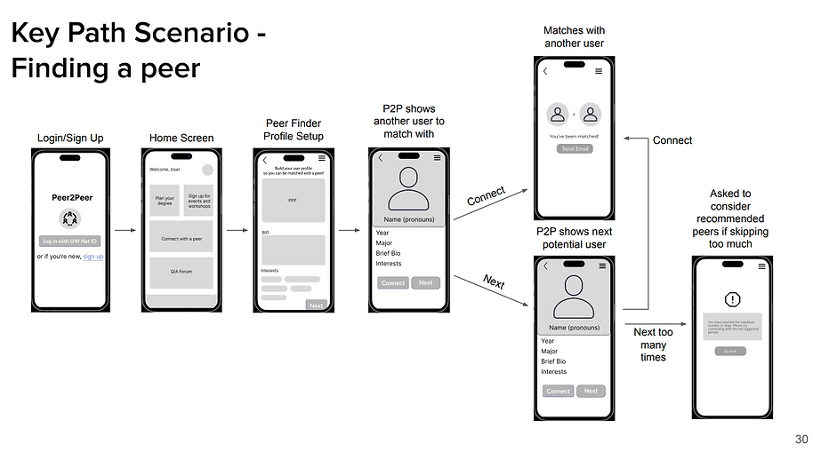
Now that we’d fully ironed out how our design was going to function according to our values, it was time to start thinking about how a user would interact with it. To do this, we set out to create storyboards, which would help us to visualize user interactions with our platform, further informing how our design was going to adapt to the environment it was to be utilized in.

Information Architecture

The end-stage of our design phase involved creating a formal diagram that outlined the hierarchy of our platform, known as an Information Architecture diagram. In working through this process, we were able to bring a deeper level of structure to the solution generated from our Design Requirements and Storyboard sections.


Prototyping

During the prototype phase my team took ideas that we formulated during the design phase and fleshed them out. Our first prototype consisted of sketches of the user interfaces with annotations, we then made a low fidelity interactive prototype based on those sketches which we used for user evaluations. Finally we created a high fidelity prototype based on the feedback and findings that we got from user evaluations.

Paper Prototypes
Lo-Fi Prototype

Utilizing our paper prototypes, we created a low-fidelity interactive prototype using Figma. This helped us work to create a solid layout to begin iterating on for a high-fidelity prototype.

See all of the Lo-Fi annotated wireframes here
Usability Testing
Usability Testing

In our testing phase, we had each of our 4 team members moderate a usability study with a student interacting with the Figma prototype. First we allowed the participants to freely go through the prototype and explore all the interactions within the prototype. Then we asked the participant to go through 3 major tasks in the prototype and comment on what they liked and what they disliked.

  • Task 1 - Explore Major Planner
    We considered this to be task to have been successfully completed when the user has successfully added both Informatics and HCDE to their major of interest and compared their similarities and differences.
  • Task 2 - Connect With A Peer
    We considered this task to be complete when the user had successfully found a peer with similar interests and sent them a request to match.
  • Task 3 - Look Up Class Information using the Q&A forum
    We consider the task to be complete  when the student clicks on a discussion post on a Q/A forum and engages with the post through an attempt to comment or read a sub thread.
Key Findings From Usability Testing
Users felt that the amount of information in the major planner was overwhelming
Peer matching transitions were unclear
Users were confused about which option to use for logging in
Navigating from different parts of the app to the home page was difficult
The functionality of filters was unclear
    Launch

    The findings gained from our usability testing led us to making several changes to peer2peer in our final High-Fidelity Figma prototype:

    • Switching the hamburger menu located at the top right of the screen to a navigation bar located at the bottom of the screen
    • Limited login options to UW net ID only
    • Streamline the process of exploring majors by excluding the compares majors function, we also felt that compare major functions would not have been feasible given our time constraints
    Check out the rest of the Hi-Fi here

    Let's work together!

    Thank you! Your submission has been received!
    Oops! Something went wrong while submitting the form.